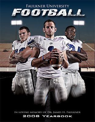
In my two years with the university, perhaps no other project has gained as much notoriety or sparked more questions than the cover of this year's Football Yearbook. Formerly referred to as media guides, the yearbooks created for each sport offer vital information about the program to potential recruits, media outlets, fans, corporate sponsors and various organizations. The books contain team and player statistics, program history, upcoming schedules and events, action shots and much more. Because we are a small school, the athletic department has always tried to ensure that the covers of these books deliver an impact. When your school's book is tossed among hundreds of others, what makes it stand out? Will it draw someone's attention?
This year I decided on more of a three dimensional concept. Typically, cover art can be flat with only a few drop shadows or various-sized text offering all sorts of layering or perspective. I was guilty of this last year. Though the book was received with much praise, it was our inaugural season and anything remotely interesting would fly. This year we'd be entering conference play for the first time and would likely be drawing more fans and media attention, and I wanted something that "popped".
I knew I wanted to focus on an odd number of players to give some symmetry to the overall image. I also knew I wanted to incorporate a stadium and I wanted it to be somewhat dark and moody, yet have highlights and contrast. The first step was narrowing down the more than 120 athletes to just three. I collaborated with the head coach on who we should feature as the cover boys for the program. There were several candidates, but we decided on sophomore quarterback Philip Moore (center), junior middle linebacker Sean Thom (left) and junior defensive end Jason Evans (right). Because we had so many other standout players on the team, we decided to feature them on other pages in the book, including the Coke advertisement that we run on the back inside cover of every book. More on this project in an upcoming post.
As you undoubtedly already know the final image is a composite of countless images and Photoshop layers. Each player was shot individually and then added to the frame and the background was a composite from a few stadium images and some Photoshop work. I will begin by discussing the lighting setup used for the player images.
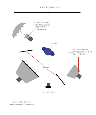
The diagram below shows the basic lighting setup for Moore, the center athlete. The overall lighting concept was very similar for all three athletes, with most of the differences coming in the form of rim lighting. When I was photographing the players, I knew what I wanted the final image to look like, but I had yet to gain access to the stadium so I was not sure how the background would look exactly or what would actually be visible given the limited scope - we wanted the players to be the dominant subject. I lit the athletes the way I hoped would work and crossed my fingers on the background at least somewhat matching my idea. [Please forgive the misspelling of "subject" in the diagrams]
As you can see the lighting setup is nothing revolutionary, but it was extremely effective here. Moore is lit using three lights. The fill light, which is actually in front do to the dominant contrast light to the side, is an Alien Bees 800 in a large foldable softbox with a grid attached to the front to help control focus and spill. It's positioned about 45 degrees or so to camera left. The harder side light, really the main light here, is coming from another AB800 reflected into a silver Westcott umbrella directly on his left side (90 degrees camera right). Because I knew that he'd be flanked by two players which would actually end up behind him, I took caution not to give him too much rim light from any dominant side. So, I went with another AB800 with a 30 degree honeycomb grid about 8 feet back and focused it like a hair light with weight going slightly to his left (camera right). I used flags to control spill from the rim and side lights. I shot this project on a Nikon D300 with a 17-55mm f/2.8 lens. The power settings from the strobes were not recorded (I will make better attempts to do this in the future), but camera settings were 1/200th at f/8 in RAW mode. White balance was set with an Expo Disc, but would fall in the 5000-5600 range for these strobes.
I photographed the subjects from a lower angle to create a somewhat more menacing and dominating perspective. Posing was rather simple. I had Moore hold a ball out in front and at a lower positions and just slightly to the left (camera right) to keep the pose from becoming too symmetrical. The defensive players offered slightly more aggressive facial expressions and the folded arms further heightened the impact of the portrait. The subjects were sprayed with a water bottle to mimic sweat and lightly padded down with a towel to keep it from looking like they just came out of the shower.
For the other players, the same lighting setup was used for both, but flipped 180 degrees to highlight the different sides of the composition. The diagram below is the layout used for Thom (cover left). I wanted a stronger rim light on both him and Evans, so I moved the AB800 with silver umbrella back approximately 45 degrees to his right (camera left) to create a harder, fuller rim light. I then moved it around a bit more because I had him facing further to my left and then attached a small foldable softbox to the other AB800 with only an inner baffle attached, giving me a slightly more contrast-y light to his left (camera right) to help highlight his shoulder pads. This light was turned down to keep it from being too overwhelming and I raised it so it to about seven feet and aimed it downward.

The rim light really makes for great separation here and it provides even more contrast to the final product. The small softbox, with inner baffle only, provides nice highlights in the triceps and forearms which helps define the muscle tone and provides more contrast.
The guys were then cut out from the black background in Photoshop and were enhanced for a gritty look. Through layers and adjustment masks I increased contrast and sharpening, removed undesirable color casts, changed color saturation and applied a bit of dodging and burning where needed. I also removed any water beads that seemed out of place or too excessive. They were then transferred to the cover template where I added a slight shadow behind Moore to give a bit of separation and then used a gradient mask to blend the legs into the dark turf.
The background was shot at about 3 p.m. in full sun. I removed undesirable artifacts from the stadium like trash cans, a player's helmet, a bench and a radio tower. Because I was dealing with an 8.5x11 inch cover, I had to cut two pieces of the stadium and merge them so that two sets of lights would have room on the cover. Blending the bleachers in Photoshop was a pain and luckily the players cover most of the overlap. The lights were obviously not lit when I photographed them, so I used various brushes in Photoshop to create the almost movieposter-like lighting effects. I generally used star effect brushes and even some comets to create the corner light flares. The background was also heavily treated with contrast adjustments and was then given contrast, sharpening and saturation treatments like the players. The sky was a gradient mask that I created in Photoshop as well. The final touches were back gradient mask at the bottom of the page and then text was added to complete the cover.
It took a lot of time, luck and trial and error to get the final product, but it was well worth the effort.
Thanks,
- R


No comments:
Post a Comment